All workDayzero.ai

Dayzero.ai

Making Complex AI Feel Understandable.

Designing a clearer digital front door for an AI company building a growing ecosystem of intelligent products and services.

CompanyDayzero.ai
RoleProduct Designer · Website UI
FocusWebsite UI, Information Architecture, Visual Hierarchy, Product Communication, Responsive Design
Project typeEnterprise AI / B2B Website
# Dayzero.ai — Website UI · Flat: composed screens
01 Agent capabilities
  • Kicker, heading and a one-line promise
  • Each capability shows its steps in a small interface
02 Enterprise integrations
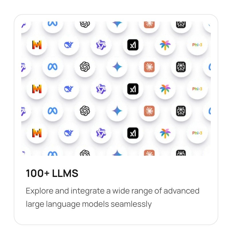
  • 100+ models shown as a field of logos
  • Integration diagrams in the same card style
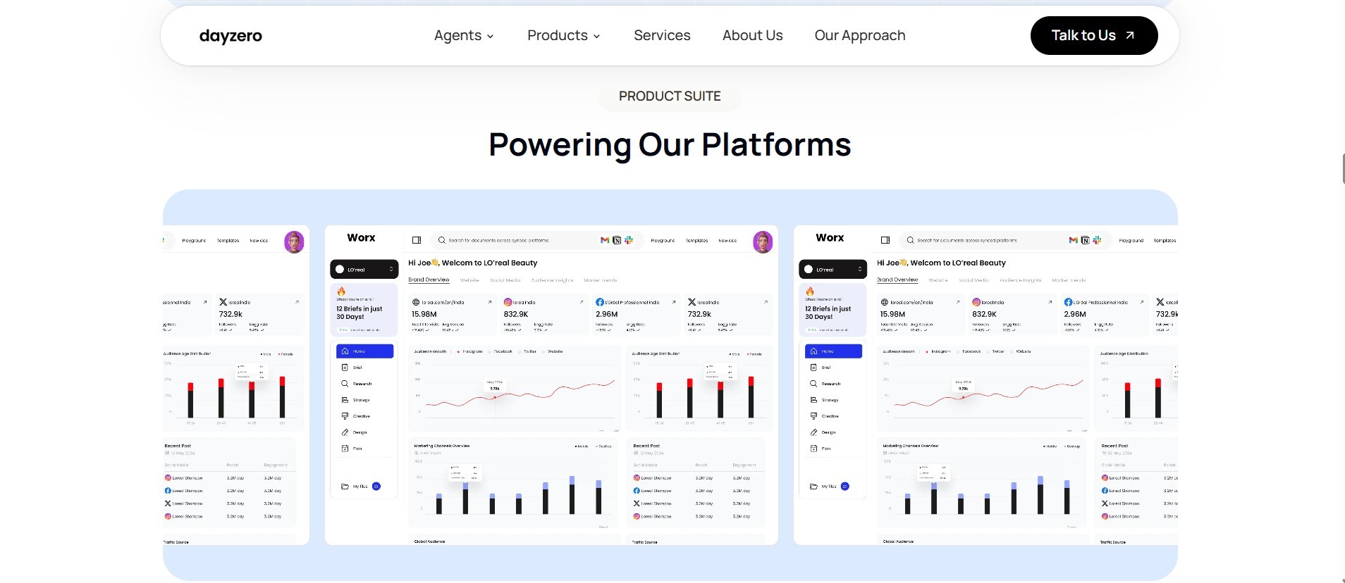
03 Product suite
  • Real product screens for each platform
  • Name, one line of value and an Explore link
+0%
Demo conversion
Share of relevant visitors who request a demonstration.
+0%
Product engagement
Meaningful engagement with product information.
+0%
Qualified inquiries
Relevant business inquiries.
Website UIIAResponsive
[01]Overview & business context

An AI product can be powerful. Its value still has to be understood.

Dayzero.ai brings together enterprise intelligence, AI employees and specialised AI products.

# My contribution

I worked on the website UI alongside the Dayzero.ai team: layout, visual hierarchy, component patterns and responsive layouts. Product, brand and engineering decisions were shared across the team.

  • Website UI
  • Information architecture
  • Visual hierarchy
  • Product communication
  • Responsive design

If visitors can't understand what an AI product does, its value is difficult to communicate.

Our website design challenge was to organise that ecosystem into a more coherent digital experience, helping visitors understand the offering, discover relevant products and move toward the next step.

? Core design question

How might we help potential customers navigate a complex AI offering, understand its business value, and find a relevant next step?

# The website, as designed

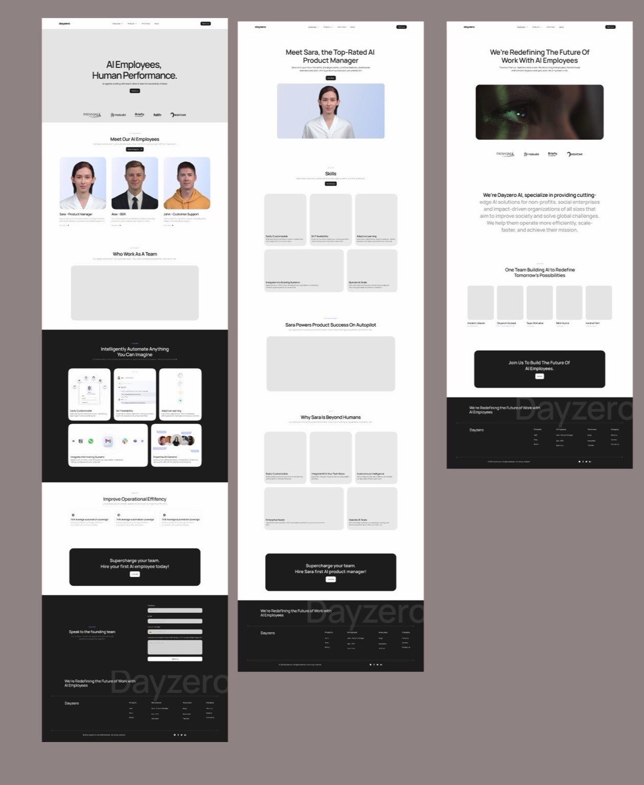
Long, single-column pages that move from what Dayzero.ai is, to what it offers, to why it's credible, to one next step.

Design filePage layouts exported from the original design file.

Dayzero.ai design file: full-length page layouts for the website, side by side
[02]The communication challenge

Making a complex product ecosystem easier to navigate.

The challenge wasn't simply displaying more product information.

It was deciding what visitors needed to understand first, how to introduce different offerings, and how to connect technical capabilities to recognisable business needs.

The interface needed to balance complexity, discoverability and a clear next step.

  1. 01What it offers
    Two menus carry the whole ecosystem
    Agents7
    • Dr. Aayu
    • Workforce QC
    • Product Manager
    • Market Researcher
    • Talent Recruiter
    • Sales Rep
    • CS Agent
    Products5
    • Faith
    • Worx
    • Briefly
    • Pushpa
    • AI Avatars
  2. 02Who it's for
    Leaders and teams, named in their own terms
    Hero
    • “AI for High Value Operations Built for Ambitious Leaders”
    Industries
    • “From manufacturing to legal services”
    Use cases by team
    • Support
    • Sales
    • Recruiting
    • Front desk
  3. 03How it guides visitors
    Every route ends in one next step
    Homepage order
    • Understand
    • Explore
    • Evaluate
    • Act
    Calls to action
    • Talk to Us — in the navigation
    • Request a Demo — in the hero
    • Request AI Employees · Book a call — closing banner
    Direct links
    • Services
    • About Us
    • Our Approach
Retrospective information architecture documentation, mapped from the live site's navigation, homepage order and footer. Quotes are the site's own wording.
[03]Translating complexity into UI

Three decisions that shape how the site is read.

3.1 Establishing a clear first impression

Say what Dayzero.ai is before asking anyone to choose.

We used visual hierarchy to introduce the broader value of Dayzero.ai before asking visitors to navigate individual products and capabilities.

What the visitor sees
  1. Headline names the offer: AI employees for ambitious leaders
  2. Supporting line turns it into a promise: onboarding, trusted results, scale
  3. Imagery shows people at work, not abstract AI
  4. One primary action: Request a Demo
  5. Client logos give early proof before any detail
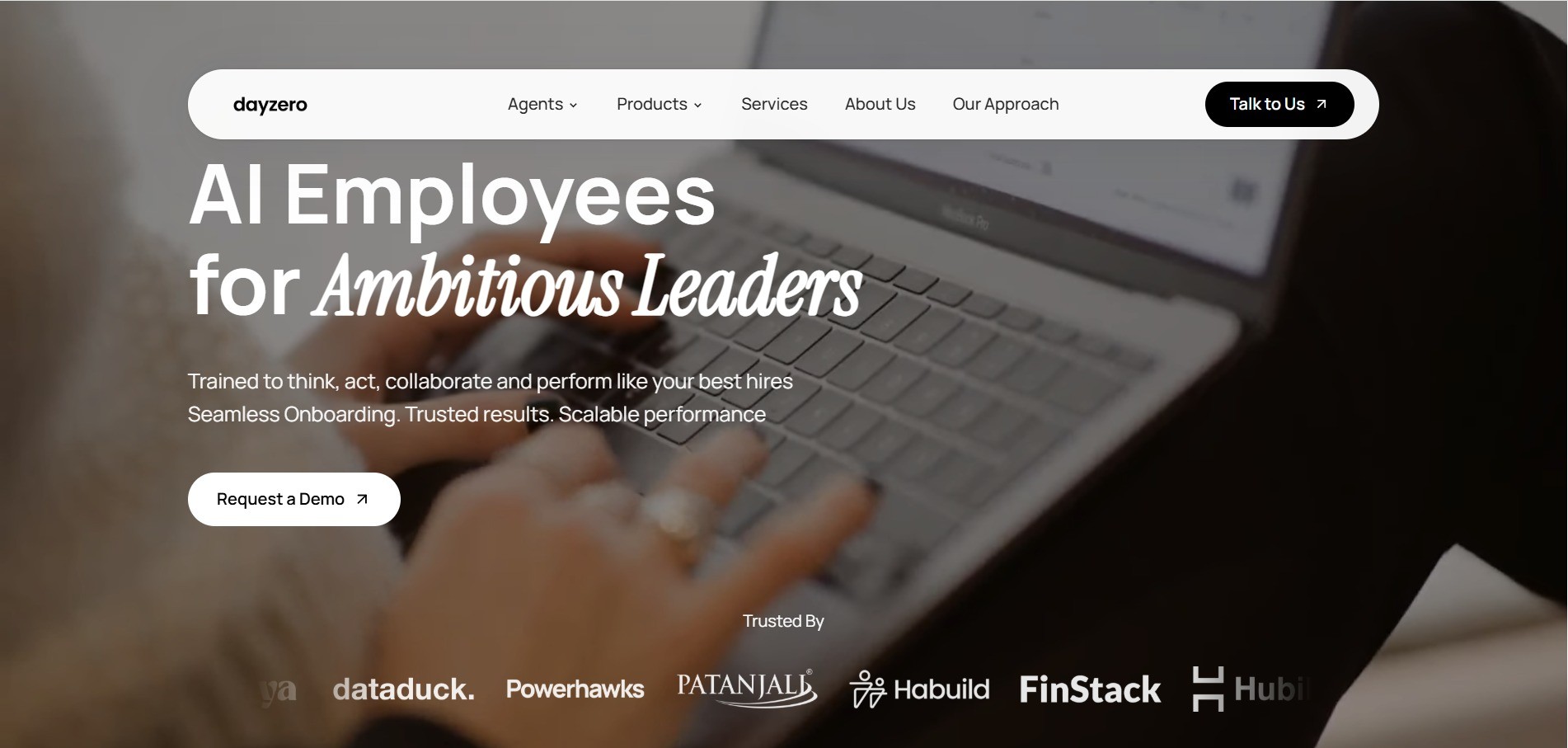
Dayzero.ai homepage hero: 'AI Employees for Ambitious Leaders', a supporting line, a Request a Demo button and a row of client logos over a photo of someone working at a laptop
3.2 Helping visitors discover relevant products

Group the ecosystem so it can be read at a glance.

Grouping related offerings helps visitors build an understanding of the product ecosystem without needing to interpret every capability at once.

What the visitor sees
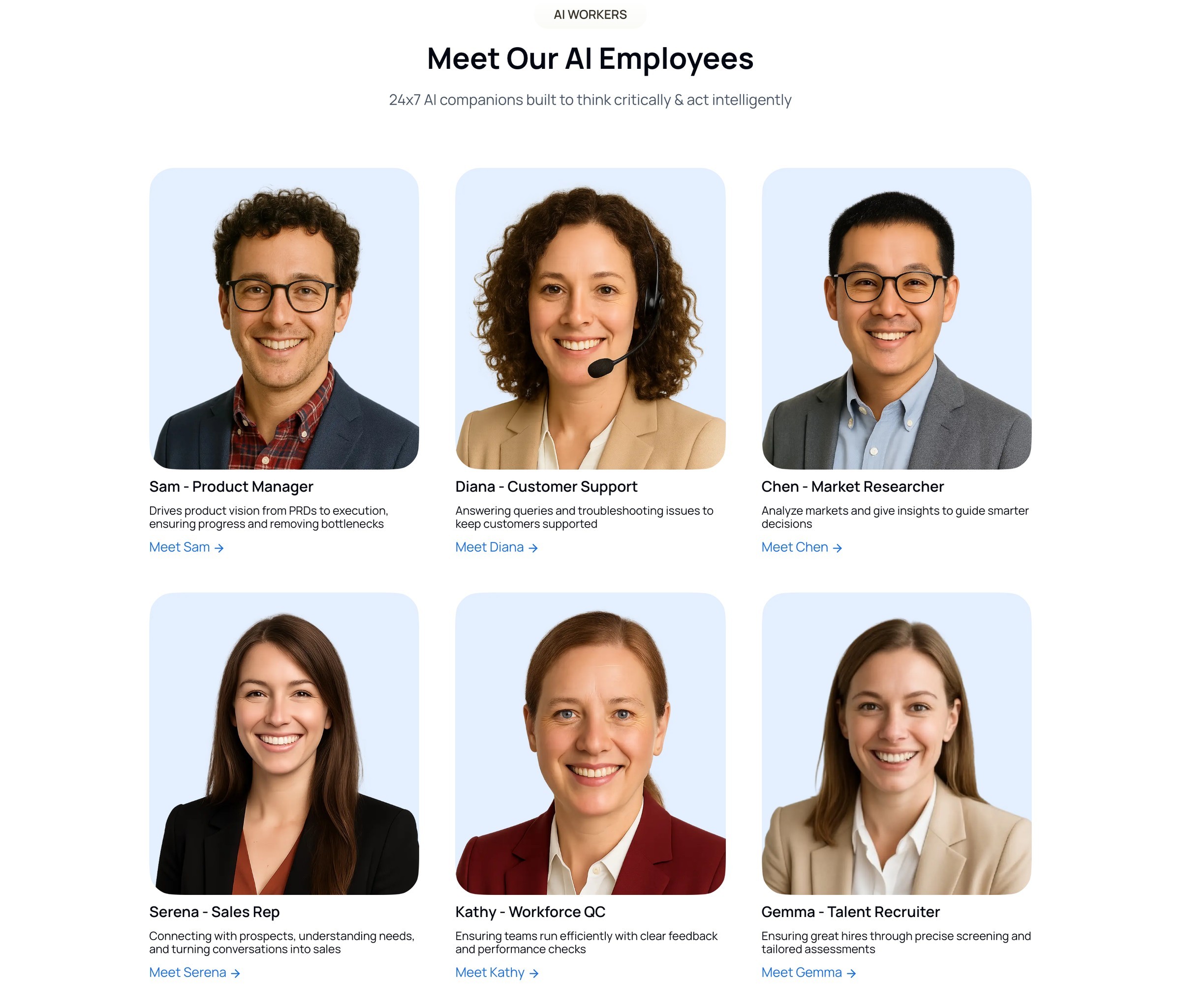
  1. Offerings grouped as AI employees, one short promise for the whole set
  2. Each AI employee is a person, so capabilities read as familiar jobs
  3. Name, role and a single line of value
  4. Every card ends in its own next step, such as 'Meet Sam →'
Meet Our AI Employees: six cards with a portrait, a name and role such as Sam - Product Manager, one line of value and a Meet link
3.3 Turning exploration into action

Every section ends somewhere useful.

An effective B2B website should help visitors move from understanding a product to knowing what action makes sense next.

What the visitor sees
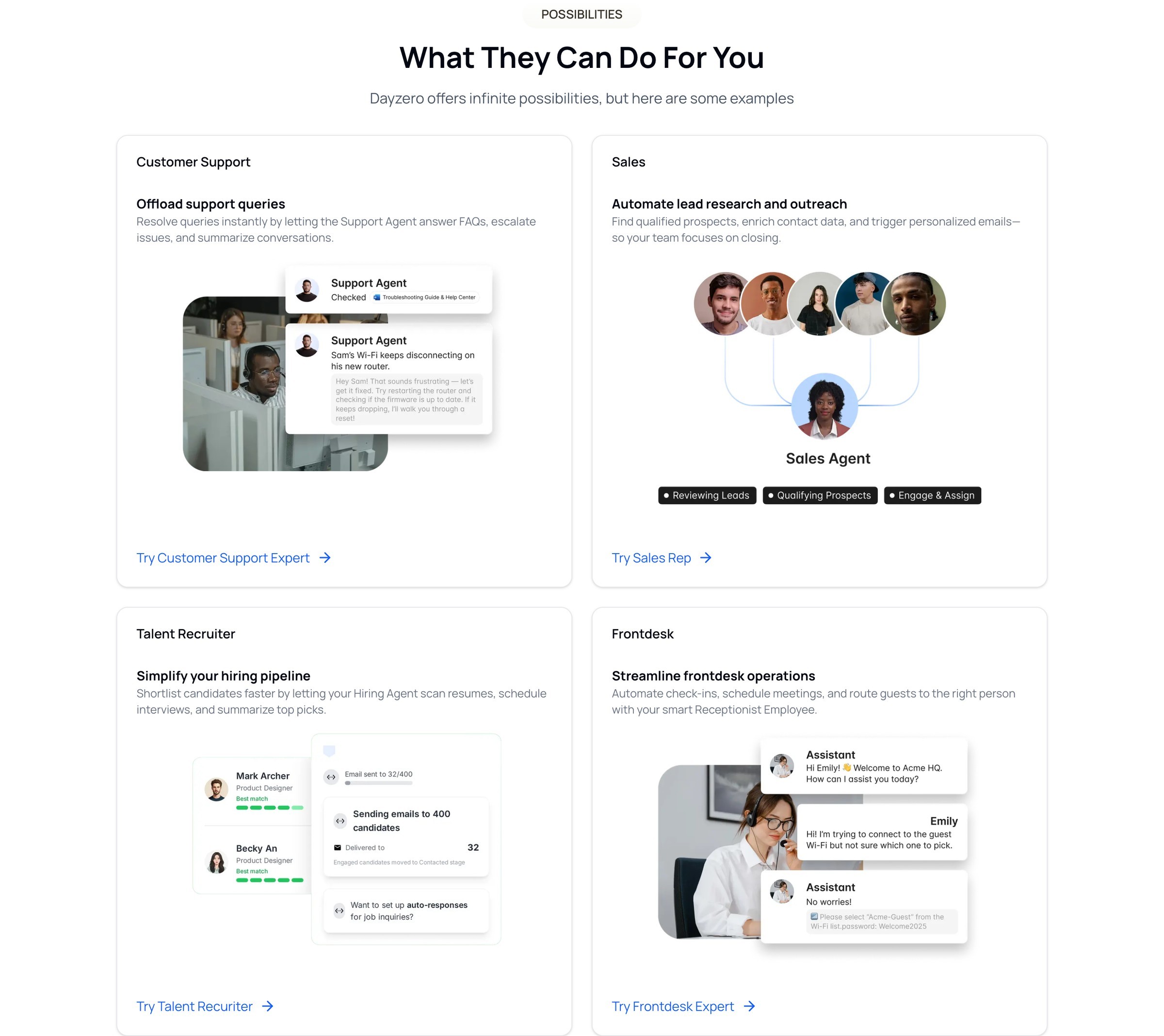
  1. Use cases are named after the team they help: support, sales, recruiting, front desk
  2. Each card states one business job in plain language
  3. A mini interface shows the agent doing that job
  4. A specific link leads to the matching AI employee
What They Can Do For You: four use-case cards for customer support, sales, talent recruiting and front desk, each with a mini interface illustration and a Try link

Every route ends in the same place: the closing banner asks visitors to request AI employees and book a call, echoing the hero's "Request a Demo" and the navigation's "Talk to Us".

Closing banner: Request AI Employees, Working for You 24 x 7, with a Book a call button
[04]Building a coherent web experience

One product ecosystem. One recognisable digital language.

Consistency helps a growing product ecosystem feel connected.

Across the website, recognisable layouts, component patterns and visual hierarchy help users understand where they are and what they can explore next.

Responsive behaviour is part of that consistency, so the experience stays understandable across devices.

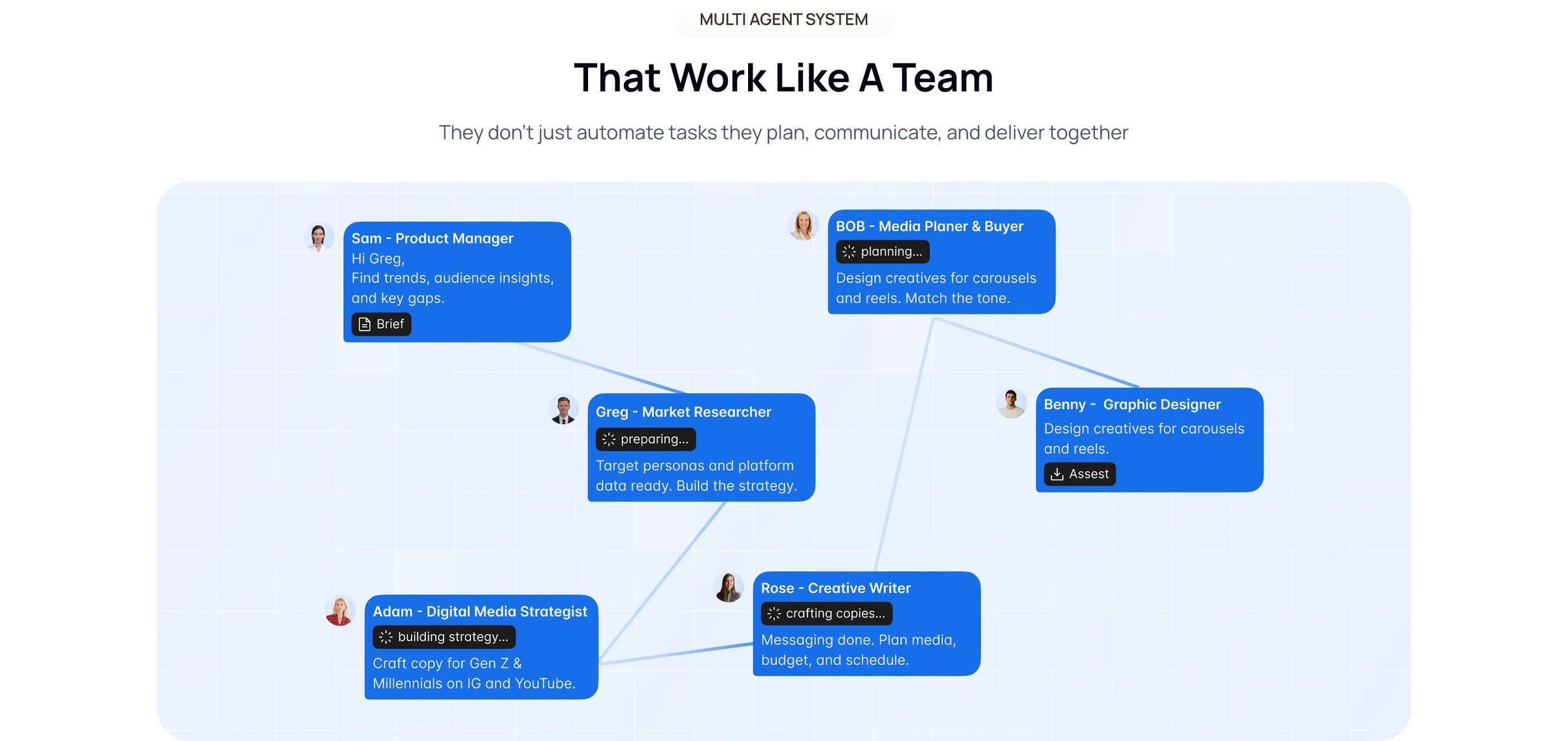
Multi-agent team section on desktop: agent cards connected in a network diagram
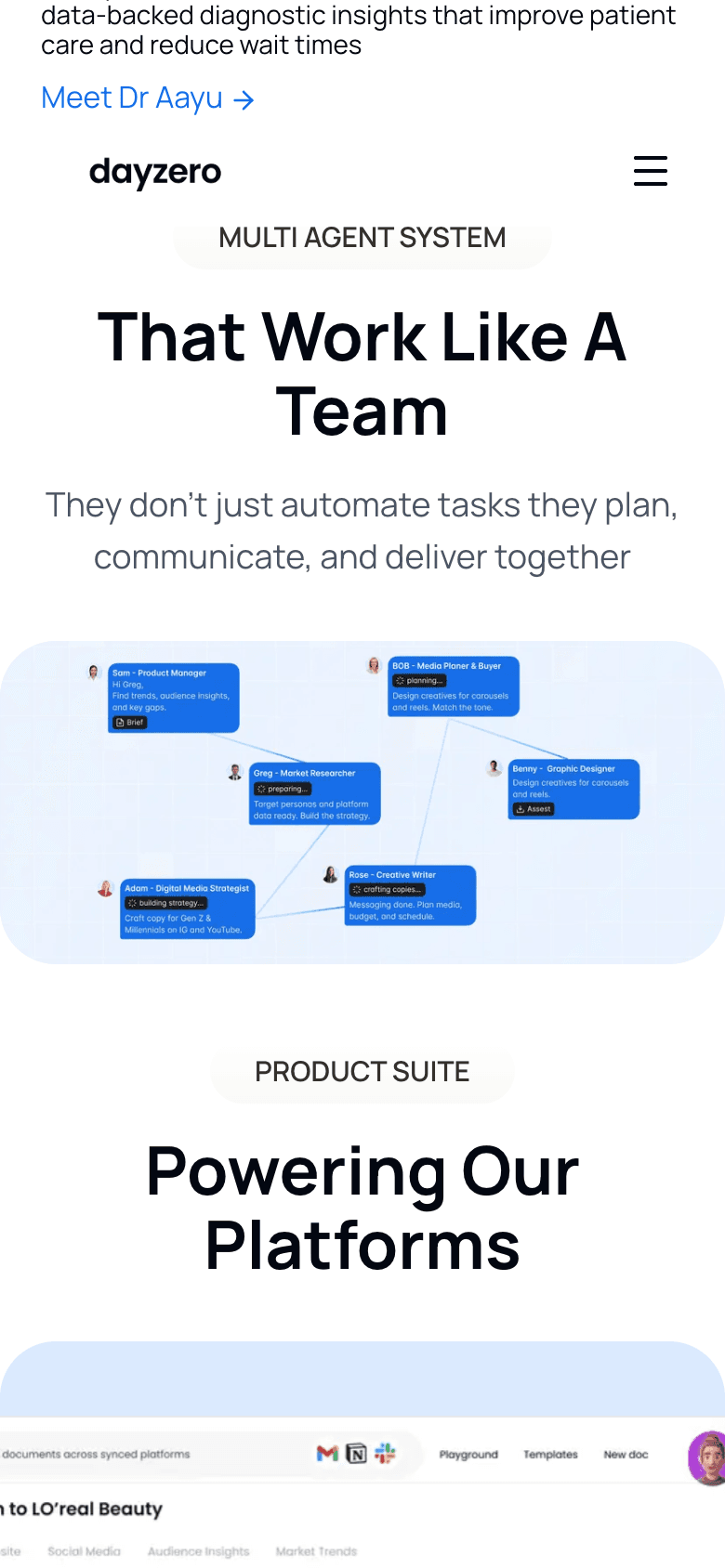
The same multi-agent team section on a 390 px phone screen, with the heading above a scaled network diagram
Live siteThe same section at 1440 px and 390 px: heading first, then the diagram scaled to fit, so the order of information never changes.
Colour palette from the design file: primary, secondary and neutral swatches with tint scales
Colour palette and tintsDesign file
Design file: Serena sales-agent capability card set
Agent capability cardsDesign file
AI employee card: portrait, Sam - Product Manager, a one-line description and Meet Sam link
AI employee cardLive site
Sales use-case card: title, description and an illustration of a sales agent routing leads
Use-case cardLive site
Read & Write capability card: three-step status list above a small document mock-up
Capability cardLive site
Integration card: a grid of language-model logos titled 100+ LLMs
Integration cardLive site

Components at natural scale. Colours come from the design file; no other tokens are claimed.

▶ Navigation in motion

Grouped menus preview each AI employee and product before the visitor commits to a page, the same grouping the homepage uses.

Live siteReal interaction, 15 s, no cursor shown. Plays when visible; respects reduced-motion settings.

[05]Business outcomes & reflection

The outcomes, and how each was measured.

+35%
Demo conversion

Requests for a demo are the clearest signal that a visitor has understood the offer and sees it as relevant.

Measures: Share of relevant visitors who request a demonstration.
+42%
Product engagement

Visits to product and AI-employee pages show whether the ecosystem is discoverable from the homepage.

Measures: Meaningful engagement with product information, such as product-page visits and depth.
+28%
Qualified inquiries

More enquiries only help if they match what Dayzero.ai offers; qualification tests whether the communication is accurate.

Measures: Business inquiries that match an offering.

Reflection

[05]Reflection
“This project strengthened my understanding of the connection between information architecture, visual design and business communication. A website doesn't just present what a company builds. It shapes how people understand the offering, evaluate its relevance and decide what to explore next. The biggest lesson for me was that communicating a complex product clearly requires the same curiosity and problem-solving as designing the product itself.”

I worked on the Dayzero.ai website alongside the Dayzero.ai team. The site shown is the team's work; my contribution focused on UI design, hierarchy and consistency. Screens marked “Live site” show the website as it is today.

[12]Say hello

Made it this far? Say helloText · 104.

Whether it's a design opportunity, a conversation about research, or just comparing notes on interesting ideas, I'd love to connect.

Local time ● online

--:--:--
Brooklyn, New York.

Version history v26.10

v26.10Portfolio rebuilt as a design file in Framer
© 2026 Tanvi Gera.Brooklyn, New YorkBack to top ↑