All workFaith AI Agents

Faith AI Agents

Giving AI Workflows a Clearer Interface.

Designing a B2B workspace that makes complex agent activity easier to understand, navigate, and manage.

CompanyDayzero.ai
RoleProduct Designer · B2B Dashboard UI
FocusProduct UI, Enterprise UX, Dashboard Design, Information Hierarchy, Workflow Design
Project typeB2B AI Agents Platform
# Faith AI Agents — Dashboard UI · Flat: composed screens
01 Talent Marketplace
  • Five product areas, always visible
  • Tips explain each area in place (2 of 5)
02 Knowledge Hub
  • Purpose of the area, then its action
  • Explains what to upload and why
03 Employee Profile
  • Name and colour-coded role tag
  • Editable skill chips
0%
Task success
Users completing a primary agent-management task, such as onboarding an AI employee.
0
Product Areas
Home, Marketplace, Tools, Workflows, and Knowledge Hub. Interface scope — not a measured performance outcome.
0%
Faster workflow setup
Completing onboarding: create an employee, give it memory, add a tool.
DashboardB2BWorkflows
[01]Overview & product context

When AI takes on more work, people still need to understand what's happening.

Faith AI Agents is part of Dayzero.ai's AI product ecosystem: a workspace where businesses build teams of AI employees.

CompanyDayzero.ai
RoleB2B Dashboard UI Designer, collaborative
FocusProduct UI, enterprise UX, dashboard design, information hierarchy, workflow design
TypeB2B AI agents platform

My work involved contributing to the B2B dashboard UI, with an emphasis on organising complex information and creating an interface that makes agent-related workflows easier to understand.

The public website introduces the product; the dashboard is where the work happens. This case study focuses on the dashboard and labels every visual by source.

Public Faith website hero: 'Team of expert AI employees devoted to work for you, like you' over a mosaic of portraits, with a Request Demo button
Marketing siteHow Faith presents itself publicly. The rest of this case study shows the dashboard.
? Core design question

How might we organise an AI-agent workspace so business users can understand its capabilities, navigate relevant tasks, and maintain visibility over the work being performed?

[02]The visibility challenge

Complex systems need understandable interfaces.

As AI systems become more capable, the interface is where people understand what is happening.

The design challenge is not just to display agent information, but to make the system's structure and relevant actions easier to recognise.

In Faith, an AI employee is assembled from parts that live in different places: a role and skills, tools, knowledge and workflows. The interface has to make those relationships legible.

Faith AI agent workflow mapUser actionSystem feedbackGap in source material
  1. 01
    Set up
    Onboarding
    ActionCreate an AI employee, then give it memory
    FeedbackFive-step pager with Skip / Next
  2. 02
    Find & hire
    Marketplace · Directory
    ActionBrowse employees or teams, search, Create New
    FeedbackProduct-tour tips (step 2 of 5)
  3. 03
    Configure
    Employee profile
    ActionEdit bio and skills
    FeedbackRole tag and skill chips on every card
  4. 04
    Equip
    Tools · Knowledge Hub
    ActionAdd tools, upload files
    FeedbackEmpty state explains what to upload and why
  5. 05
    Run
    Workflows
    ActionPick a category, run a template
    FeedbackConnected apps and assigned team on each template
  6. 06
    Follow up
    Conversations · status · review
    ActionNot in the captured screens
    FeedbackNot documented here
Persistent sidebar ties every stage togetherHome · Marketplace · Tools · Workflows · Knowledge Hub · Conversations
Retrospective artifactRetrospective workflow documentation based on product UI. Stage 06 is shown as a gap because no screens for it were captured.
[03]Designing the agent workspace

Three areas, one way of reading them.

3.1 A recognisable starting point

Home starts with one clear first action.

Challenge

A new workspace offers many possible directions: hire an agent, add tools, upload knowledge, run a workflow.

UI response

We put one prompt at the top, 'Build your first AI employee', above a browsable talent marketplace, with the product areas fixed in the sidebar.

Why it helps

People can see where to begin and where everything else lives, without reading the whole page.
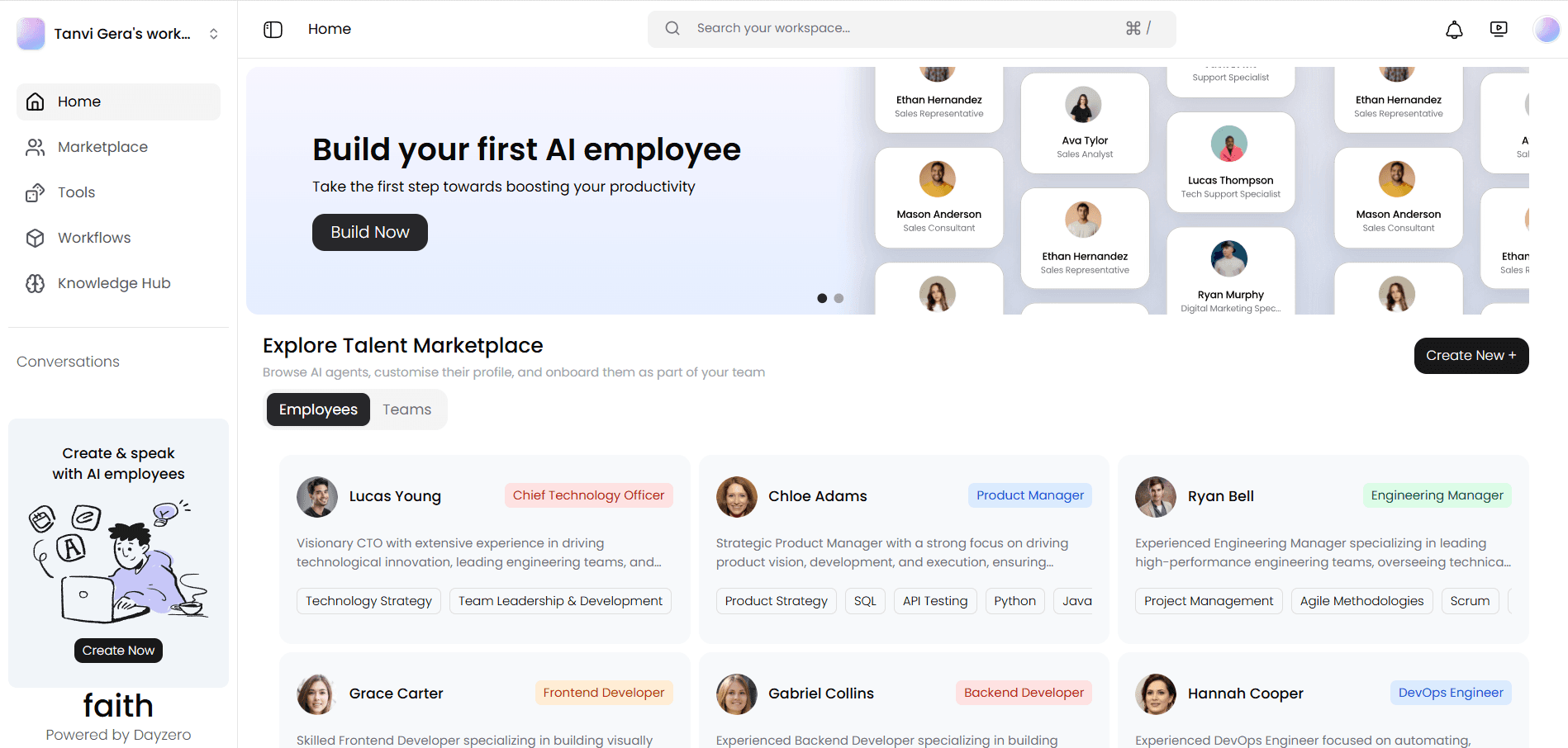
Product UIHome
Faith dashboard home: sidebar with Home, Marketplace, Tools, Workflows and Knowledge Hub; a 'Build your first AI employee' banner with a Build Now button; and an Explore Talent Marketplace grid of employee cards
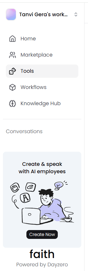
  1. Sidebar: the five product areas, always visible
  2. First-action prompt: Build your first AI employee
  3. One primary button
  4. Employees / Teams switch
  5. Colour-coded role tag on every card
  6. Create New for custom employees
3.2 Organising agent information

Agents read like a team directory.

Challenge

Each AI employee carries a role, a description and a set of skills, and the marketplace holds many of them.

UI response

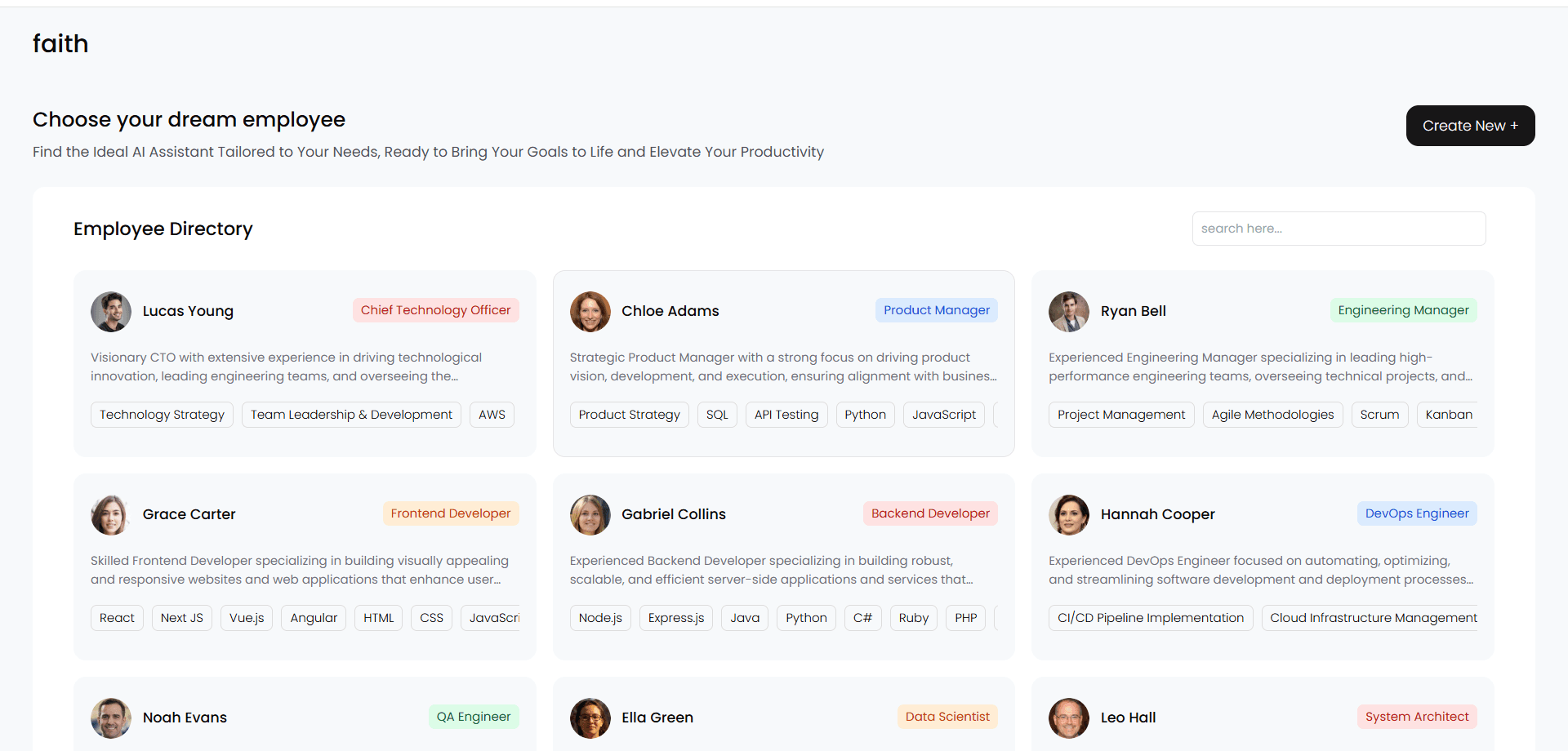
We used one card pattern everywhere: avatar, name, a colour-coded role tag, a short bio and skill chips. The profile (shown in the hero above) repeats the same structure in more depth.

Why it helps

A consistent card makes agents comparable at a glance and predictable to open.

Product UIEmployee directory
Choose your dream employee: an employee directory of cards, each with avatar, name, coloured role tag, short bio and skill chips, plus search and a Create New button
  1. Search within the directory
  2. Role tag, colour-coded by discipline
  3. Two-line bio, truncated for scanning
  4. Skill chips for quick comparison
  5. Create New
3.3 Making capabilities understandable

Tools and workflows share one grammar.

Challenge

What an agent can do depends on its tools, the knowledge it has and the workflows it runs: three different kinds of configuration.

UI response

We gave each area the same structure: a title and one-line purpose, a filter, then cards that end in a single verb, such as 'Add tool' or 'Run'. The Knowledge Hub (in the hero) follows the same pattern with 'Upload files'.

Why it helps

Once people learn one area, the others read the same way.

Product UITools
Tools library: title and purpose line, a Tools / Templates switch, and tool cards such as Web Search and Image Generator, each with an Add tool button
  1. Current area highlighted in the sidebar
  2. Title and one-line purpose
  3. Tools / Templates switch
  4. Card: name, icon and what the agent gains
  5. One verb per card: Add tool
Product UIWorkflows
Workflows: category tiles for Research, Marketing, Operation, Design and Tech, then workflow template cards showing connected apps, a Run button and the assigned team
  1. Categories filter templates by team
  2. Connected apps shown on each template
  3. One verb per card: Run
  4. Assigned team visible before running
  5. Create New for custom workflows

Not shown: task status, agent activity and output review. These areas are not in the captured dashboard screens, so this case study does not describe them.

[04]Making AI workflows understandable

Designing clarity into the system.

In enterprise products, clarity isn't just about individual screens.

It comes from the relationships between navigation, information, system feedback and the actions people need to take.

Consistent patterns help users develop a clearer mental model of the system.

Sidebar: workspace switcher, Home, Marketplace, Tools (selected), Workflows, Knowledge Hub, Conversations and a Create Now promo card
Navigation · current area · workspace
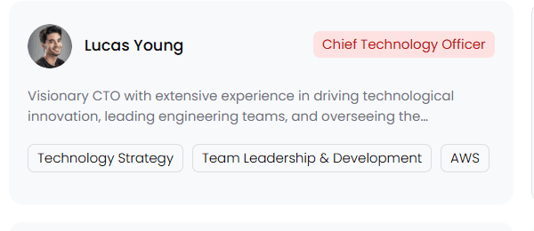
Employee card: Lucas Young, Chief Technology Officer role tag, bio and skill chips
Employee card · role tag · skill chips
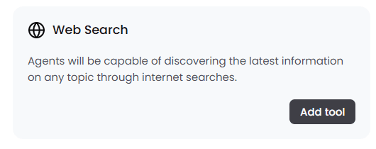
Tool card: Web Search with a one-line description and an Add tool button
Tool card · single action
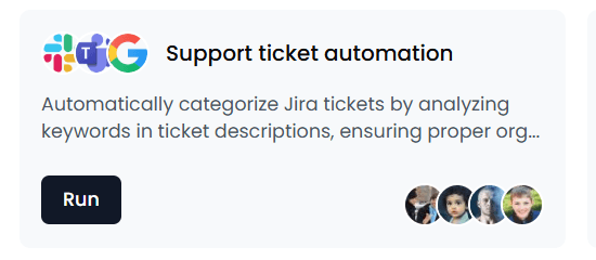
Workflow template card: Support ticket automation, connected app icons, Run button and assigned team avatars
Workflow template · Run · team
Knowledge Hub empty state: Upload relevant data, boost your team's capabilities by incorporating relevant data into its memory
Empty state · explains the next step

Product UIComponents cropped from the dashboard screens at natural scale, not redrawn.

# Workflow example

First run: one step at a time, then a guided tour.

Onboarding step 1 of 5: Create your AI employee, with Skip and Next
Step 1 of 5Create your AI employee
Onboarding step 2 of 5: Give them memory, upload files from local, cloud or public URLs, with Skip and Next
Step 2 of 5Give them memory
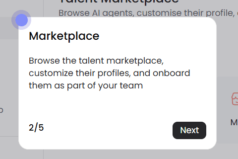
Product tour tooltip on the Marketplace: 'Browse the talent marketplace, customise their profiles, and onboard them as part of your team', step 2 of 5, Next
In the workspaceTour tips explain each area in place

Product UIOnboarding steps 3–5 were not captured. No dashboard recording exists, and none was staged.

[05]Business outcomes & reflection

The outcomes, and how each was measured.

85%
Task success

Whether people can complete the primary agent-management task, such as finding and onboarding an AI employee, is the baseline of usability.

Measures: Share of participants completing the task unaided.
5
Product Areas
Interface scope — not a measured performance outcome

Home, Marketplace, Tools, Workflows, and Knowledge Hub.

Source: the dashboard's sidebar navigation, as captured.
30%
Faster workflow setup

Setup time is the cost a business pays before an agent does useful work.

Measures: Time to complete onboarding: create an employee, give it memory, add a tool.

Reflection

[05]Reflection
“Faith made me think about a different kind of design challenge: making a sophisticated system feel manageable without pretending the complexity doesn't exist. For an enterprise product, clarity comes from the relationship between information, navigation, system states and the decisions users need to make. The project reinforced my interest in designing tools that make complex technology easier for people to work with.”

I contributed to the Faith dashboard UI alongside the Dayzero.ai team. The product, its AI and its engineering are the team's work; my contribution focused on UI design and information hierarchy.

[12]Say hello

Made it this far? Say helloText · 104.

Whether it's a design opportunity, a conversation about research, or just comparing notes on interesting ideas, I'd love to connect.

Local time ● online

--:--:--
Brooklyn, New York.

Version history v26.10

v26.10Portfolio rebuilt as a design file in Framer
© 2026 Tanvi Gera.Brooklyn, New YorkBack to top ↑